You immediately realize living in San Francisco how the pedestrian is valued above all modes of transportation. Not only is the city adept at taking down freeways and making parking impossible, it enjoys pitting pedestrians against at-grade Muni trains and streetcars. Watching enormous Google buses agonizingly wait to turn against hordes of pedestrians is another fun sight. But a particular piece of infrastructure that has always caught my eye has been crosswalk markings. Public Works calls them “decorative crosswalks” and they pop up all over the city, some designed by community vote. We can attribute today’s streetscapes to Gavin Newsom’s push for Great Streets.
The crosswalks are certainly beautiful, but let’s be real this isn’t Italy with terrazzo and marble. American crosswalks are enhanced as a vestige of the safe routes movement and the public works maintenance mantra ensures the lowest-cost method is used. This interesting DOT survey of crosswalk markings indicates thermoplastic is the preferred method with a whopping lifespan of 7 years. I personally would prefer to see more material-based crosswalks with brick or formed concrete with contrasting colors. I’d love to see someone try a Kasota stone crossing.
Alas, San Francisco roads are heavily used by big buses daily, and add-in that post-earthquake, such materials would present more hazardous conditions than asphalt. So onto the parade of crosswalks.

Market and 9th. This is the prototypical crosswalk marking, with simple 2 feet wide white stripes on either end of the walkway. Most places in the city, this stuff is just paint and badly faded. While simple and utilitarian, it provides merely a marker for vehicles to stop, but very poorly seen. They’re prevalent Downtown. This looks alright for Market since market uses colored concrete but elsewhere it’s plain asphalt and the bars look dated.

Guerrero and 24th Street. I would call these yellow stripes crosswalk 1.1-beta release. This style of walk became prevalent in the ’90s as a result of safe routes, because it screams to drivers: walkway, don’t hit anyone. Most major intersections have them. The vertical lines are easily identifiable, but for a pedestrian, the feeling of being inside these paths is disorienting because the eye is drawn to follow the lines. It’s sort of like playing frogger on yellow lily pads. Also the design lacks a prominent stop bar and the hollow spacing suggest ambiguity (like maybe somewhere here there will be people moving about). This means drivers typically stop sort of where they think the walk begins. This design is typically combined with the white stripes, creating a Warhol-esque playground.

Noe and Church. This is a Great Streets evolution of painted crosswalks. Here they’re sealing thermoplastic to create a brick pattern upon newly laid asphalt. It’s fun and whimsical! The color choice of red is a little bizarre to my eyes, since science has proven red isn’t actually a really good color for stopping. But the Noe businesses wanted it. I’ve crossed these plenty of times as car and person, and the inverted brick colors feel like Tron. Also the stop bar is a good four feet, creating a weird separate pseudo-crossing. It doesn’t help that this four-way stop intersection is such a cluster.
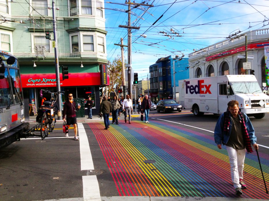
Castro and 18th. The internet was a rave last year when these rainbow walks debuted. These actually seem the most successful of all decorative walks in the city. The design and spacing promote the intersection as a destination, not simply a place to get from A to B. It’s art, it’s bold, it’s not a compromise, this is what Great Streets really is about. Also the stop bar is perfectly spaced for clear and concise instructions. Nothing screams “people live and move through here” than this.
Leave a Reply
You must be logged in to post a comment.